The Ultimate Style Guide
A comprehensive showcase of every markdown element, specifically designed for Metrosite's achromatic M3 aesthetic.
Welcome to the official style guide for Metrosite. This post is designed to test every single aspect of our typography, spacing, and design tokens to ensure a perfect reading experience.
Headings and Hierarchy
We use Google Sans Flex to create a distinct hierarchy. Notice how the headers use a tighter font stretch compared to the body text.
Third-Level Heading
This is an H3 heading. It’s used for sub-sections within a major topic.
Fourth-Level Heading
Even H4s are styled to maintain consistency while remaining distinct from the body text.
Typography & Inline Elements
Metrosite prioritizes clarity. We use a line-height of 1.7 to ensure long-form content is easy to digest. You can use bold text for emphasis, italics for nuance, or both if you’re feeling adventurous.
You can also use inline links which have a subtle underline and a smooth hover transition to match our M3 primary color.
Blockquote / Callout This is a custom blockquote. We’ve designed it to work as a “Callout” or “Note” section. It uses a thick vertical border from our
--md-sys-color-outlinetoken and a very subtle background to pull the reader’s eye without being distracting.
Code and Technical Documentation
For developers and power users, code clarity is essential. We use JetBrains Mono for all code-related elements.
Inline Code
To verify your installation, you might need to run metrolist --version in your terminal.
Code Blocks
Here is a sample of how we render full code blocks with syntax highlighting and proper surface container backgrounds:
interface MetrolistConfig {
  theme: 'dynamic' | 'achromatic';
  accentColor: string;
  enableMaterialYou: boolean;
}

const config: MetrolistConfig = {
  theme: 'dynamic',
  accentColor: '#FFFFFF',
  enableMaterialYou: true
};
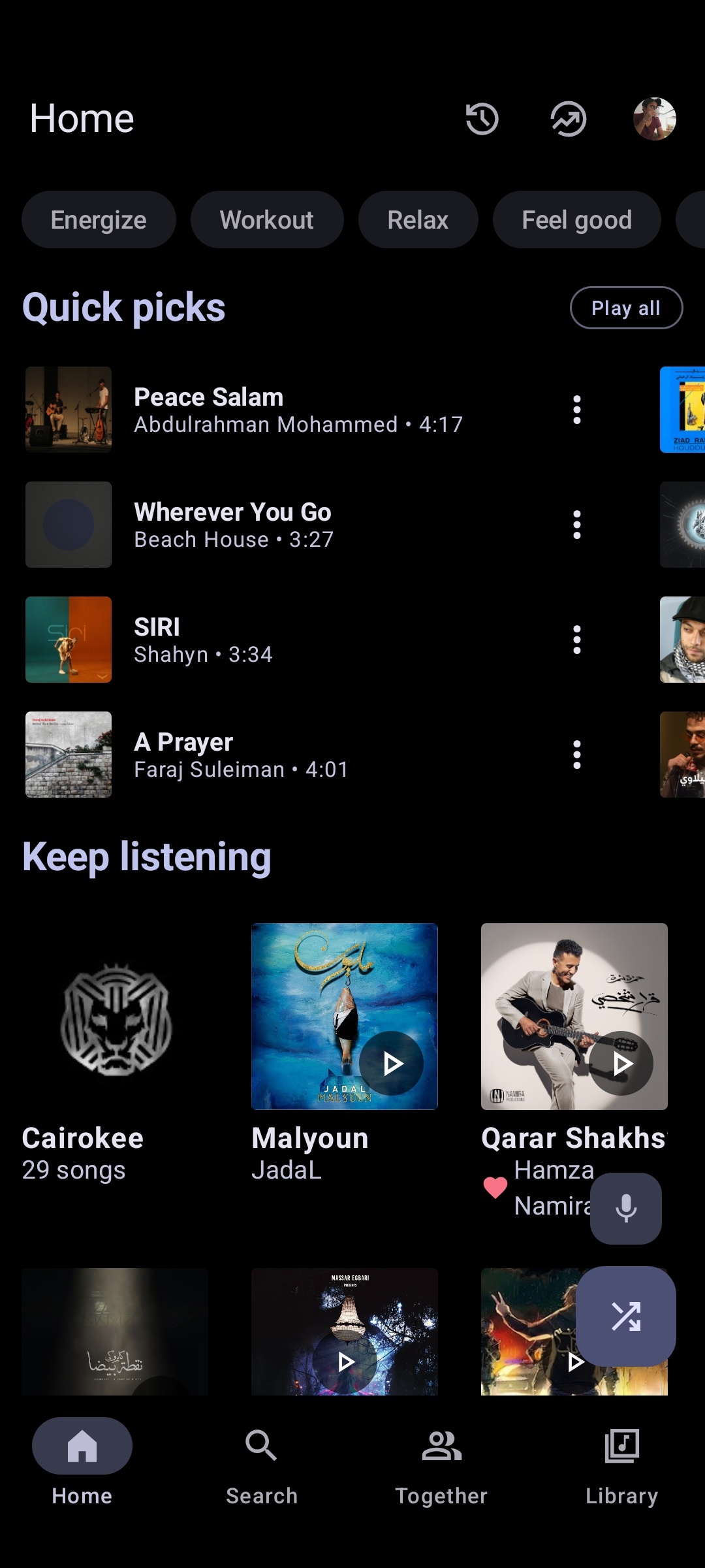
Media and Visuals
Images are automatically styled with rounded corners and a subtle outline to separate them from the background.
Text and Image Splitting
Sometimes you need to explain a complex feature while showing it. You can wrap text and an image inside our new split-layout utility to make them sit side-by-side on desktop, but stack naturally on mobile devices.
This behaves exactly like normal Markdown, allowing you to use all your standard typography and list elements right next to the showcase image without needing complex CSS.
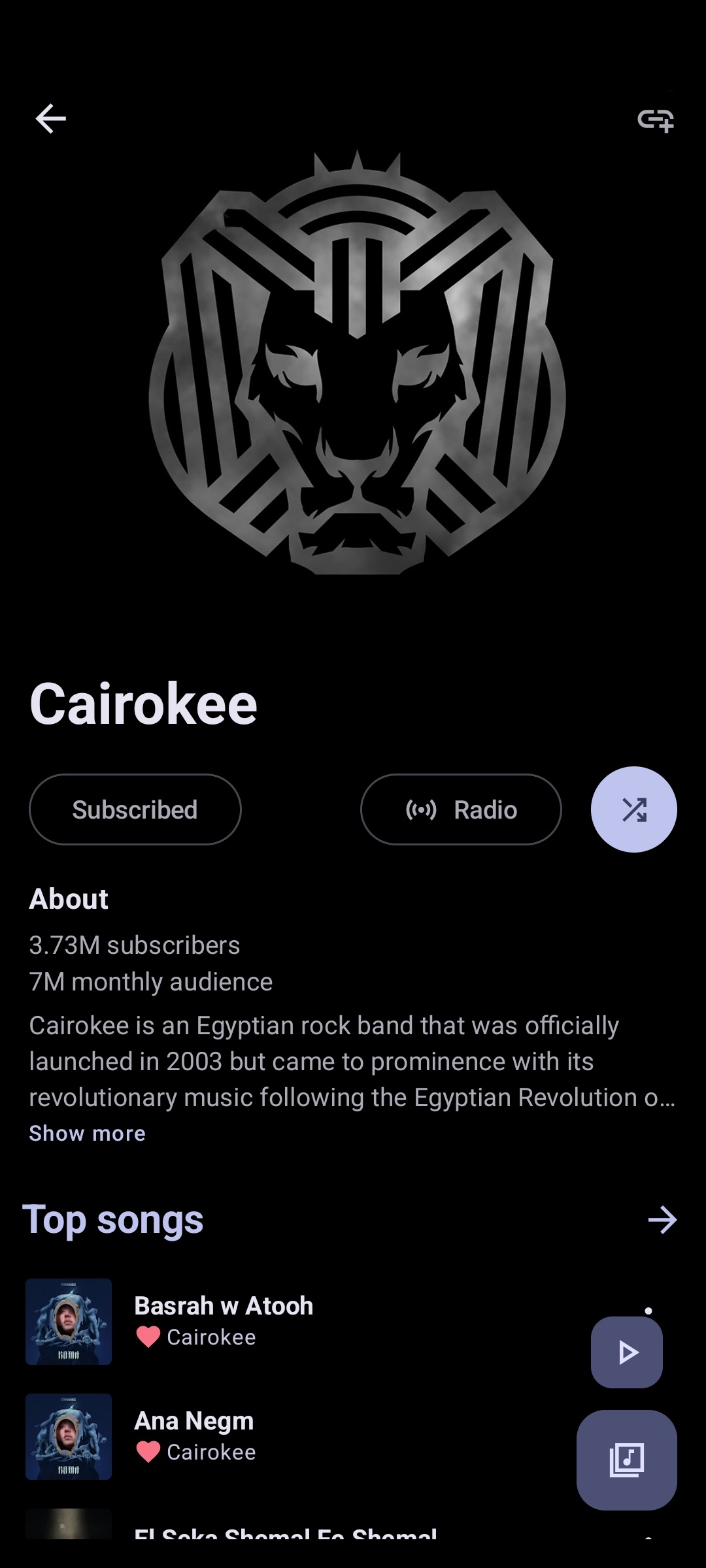
A side-by-side comparison of the Home and Artist View showing consistent Material You implementation.
Data and Organization
Unordered Lists
- Simplicity: No icons, just clean typography.
- Performance: Built with Astro for lightning-fast speeds.
- Privacy: No tracking, no ads, just your music.
Ordered Lists (Steps)
- Download the APK.
- Grant permissions.
- Enjoy your music.
Tables
| Feature | Metrolist | Official App |
|---|---|---|
| Ad-free | Yes | No |
| Background Play | Yes | Subscription |
| Material You | Native | Partial |
| Open Source | Yes | No |
Conclusion
This style guide ensures that as Metrosite grows, every post remains beautiful, readable, and perfectly aligned with the Material 3 design system.